Boldness in the Bland: EwingCole Designers React to Pantone’s 2026 Color of the Year
Pantone’s “Color of the Year” is widely perceived as a forecast that reflects cultural mood, anticipated consumer preferences, and the emotions designers aim to evoke. Once announced, many industries, from interior design, fashion, and cosmetics, to packaging, branding, and product manufacturing, adopt it in upcoming collections, product lines, and design palettes.
“Oh, I see. You think this has nothing to do with you.”
What does the COTY have to do with the rest of us? Fictional fashion mogul, Miranda Priestly, portrayed by Meryl Streep in the 2006 cult classic The Devil Wears Prada, famously illustrated how color selection by industry leaders has broad reverberations, ranging from high-end designer goods to items found in “tragic casual corner” clearance bins. Because of Pantone’s status as a “global color authority,” designers and brands often use the chosen hue as a low-risk way to appear contemporary and culturally tuned-in, a response that can quickly “trickle on down” and percolate over months or even years, saturating the cultural aesthetic. One way or another, we have all felt the impact of past Colors of the Year at some point in our day-to-day. But will the 2026 COTY have the same effect?
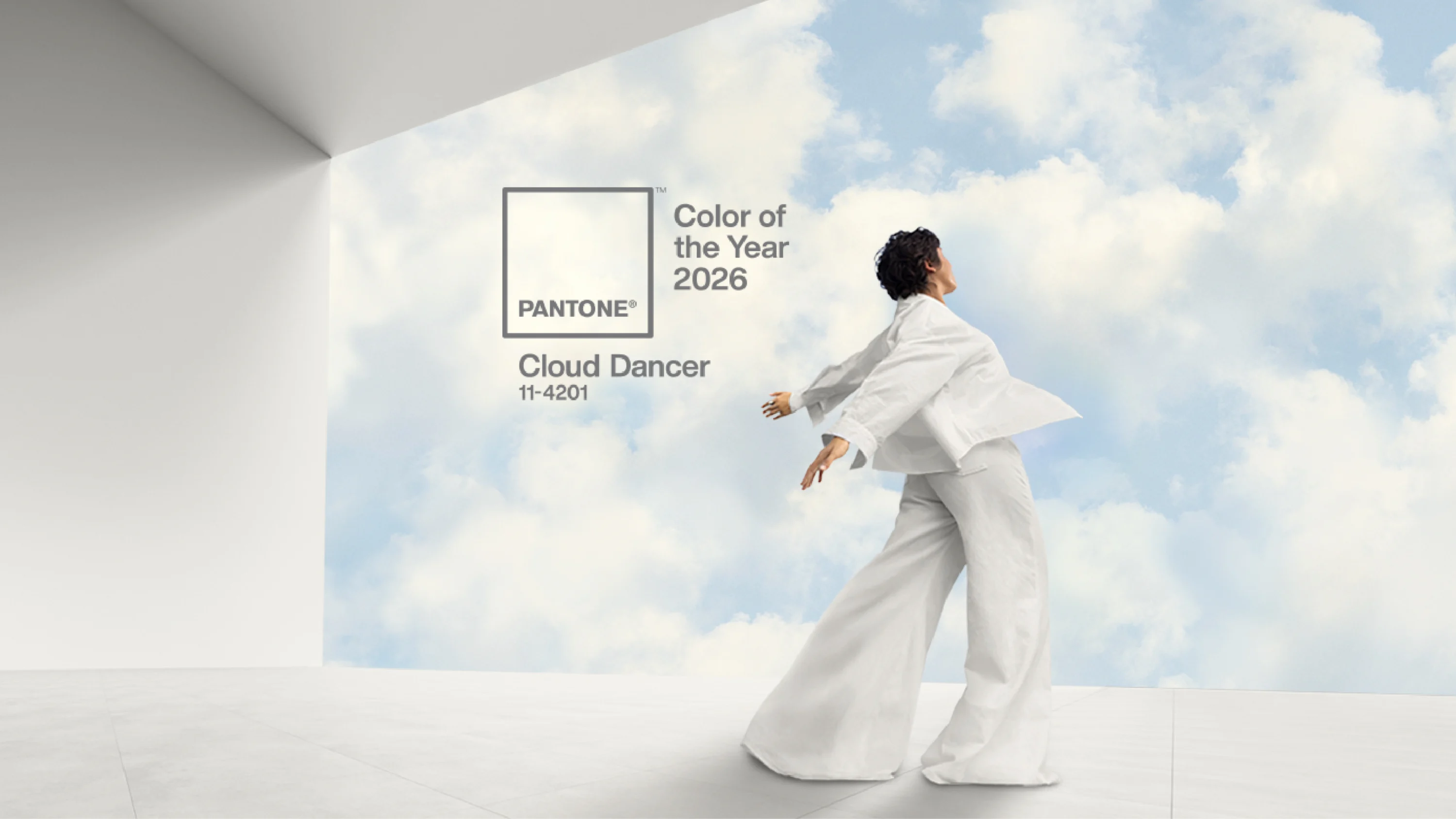
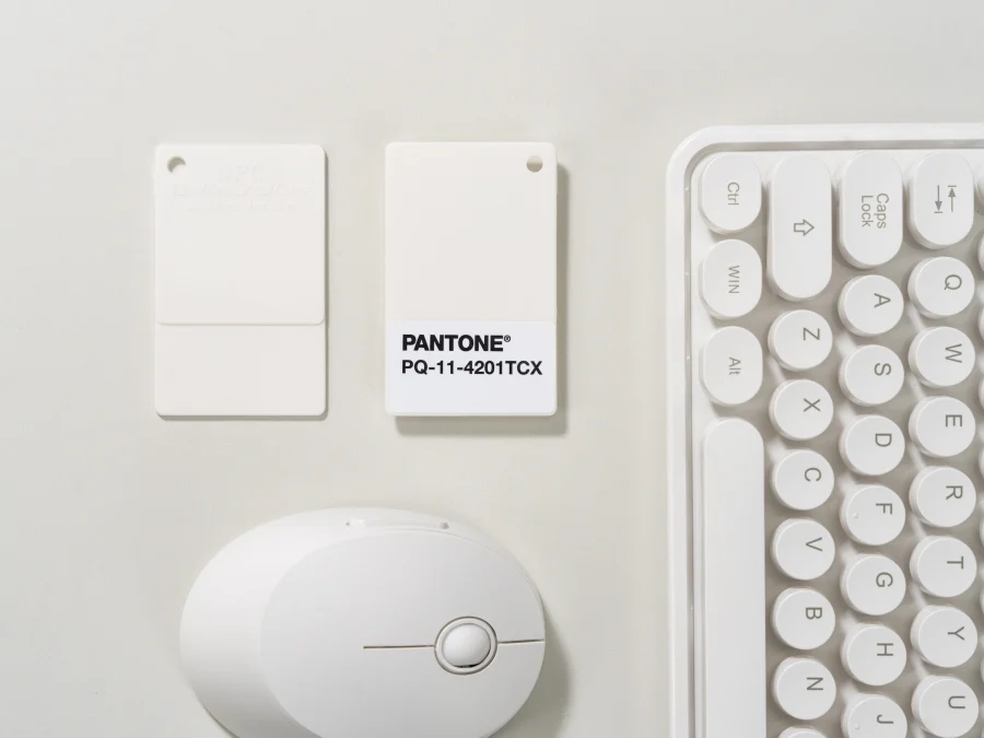
Introducing, Cloud Dancer
The 2026 Color of the Year, PANTONE 11-4201 Cloud Dancer, is “a lofty white that serves as a symbol of calming influence in a society rediscovering the value of quiet reflection.” This natural shade of off-white encourages stillness and self-reflection, stirring our imagination and inviting the mind to drift from trepidation to tranquility.
Leatrice Eiseman, Executive Director of the Pantone Color Institute, says Cloud Dancer is “a promise of clarity” in an ever-changing present in the face of an uncertain, technologically advancing future.
“The cacophony that surrounds us has become overwhelming, making it harder to hear the voices of our inner selves. A conscious statement of simplification, Cloud Dancer enhances our focus, providing release from the distraction of external influences.”
– Leatrice Eiseman, Executive Director of the Pantone Color Institute.
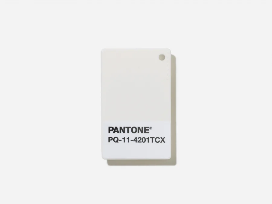
This is the first time in more than a quarter of a century that Pantone has selected a shade of white for its COTY. Callie Holtermann of the New York Times called the selection a “conspicuous choice,” noting the cultural and political climate around diversity, equity, and inclusion initiatives. Forbes called it “unprecedented,” considering the color authority’s long track record of vibrancy, richness, and suavity. The Washington Post notes that Cloud Dancer is “technically not a color at all.” Regardless of where you stand, Pantone caught the world by surprise.
Beyond clothing, marketing, and cosmetics, the COTY can also have sweeping implications for architecture and interior design. The question is whether the industry will embrace it or force Pantone to wave the white flag? Our designers are weighing in.

What was your initial reaction to this year’s Pantone Color of the Year? Do you love it? Hate it? Does it surprise you?
Andrew Donaldson-Evans, AIA, LEED AP, Regional Director of Design: Choosing a white is unexpected and, I would say, equal parts controversial and innovative. Controversial for being such a safe and unremarkable pick, in a way, almost like a loophole in the whole endeavor of picking a color of the year. Who could find it objectionable? And yet, it is also innovative for finding a wide range of colors that rightfully should be considered, and innovative in that it challenges many assumptions we hold about color and palette.
Jill Wheeler, AIA, NCIDQ, LEED AP, Regional Director of Interior Design: It’s a welcome palate cleanser to the “so much” culture we live in. But I think Cloud Dancer reflects more than a cultural response to burnout. For me, it symbolizes openness rather than exclusivity.
Cheryl Hanson, NCIDQ, Associate: I was certainly surprised. Pantone selected a shade of white that, if you have been following the media coverage, has been quite controversial. I cannot remember a color receiving so much coverage. This neutrality leaves more open interpretation and raises questions about what “color of the year” is meant to represent now.
Michael Hoak, AIA, LEED AP BD+C, EDAC, Principal: I’m shocked that a shade of white made the cut!
Matt Barnett, AIA: I am as indifferent to Cloud Dancer as Pantone was to color saturation this year. White, in my mind, is the absence of color.
Some see the color as meant to influence aesthetics in 2026. Others see it as a response to a broader societal shift in attitude, character, or ‘vibes.’ Where do you fall on that spectrum?
Hanson: The Color of the Year is meant to shape aesthetics and offer a fresh perspective on where the year might head with regard to color. While I’m open to a calm, neutral “reset,” I can’t help missing the personality and richness that a more vibrant hue would bring, and the unusual pairings and creative possibilities that come with it.
Wheeler: Cloud Dancer resets the past and opens the door to fresh opportunity ahead. It’s more about possibility than it is erasure. It is the backdrop against which every voice, every shade, can be seen. Cloud Dancer is a reminder that design, like society, flourishes when it embraces difference and creates harmony from contrast.
If you were to build a palette around this color, what other hues would you choose to complement or balance it?
Donaldson-Evans: I am less intrigued by the specifics of Cloud Dancer’s tone. When designers think about color, we assume that there is a neutral – often white – canvas from which to start, but that is a construct of the design profession more than a reality of the world around us. What makes this choice remarkable is the idea that it reorders assumptions about what counts as color, which is worth noting. We can begin to rethink white not as an assumed background but something exceptional, worthy of celebration, whether we reconsider it to be the star of the show or recognize the heavy lifting it has been quietly doing all this time.
What feelings or spatial qualities do you think this color naturally evokes?
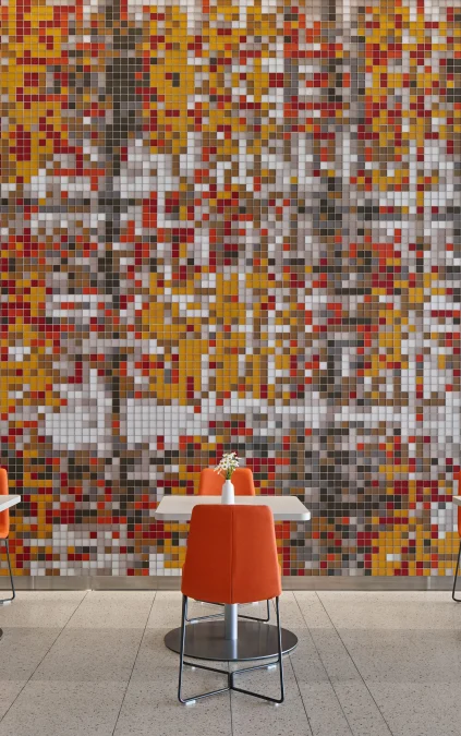
Hoak: This color evokes feelings of optimism, warmth, and playful energy. It naturally brings a sense of openness and vibrancy to a space, creating an atmosphere that provides depth and opportunity for layering. Its character sparks creativity and forward motion, while its balanced undertones keep it approachable and harmonious. In interiors, it can make spaces feel brighter and more expansive, encouraging connection and energy. Overall, it’s a color that transforms environments into uplifting, expressive spaces.
Barnett: An all-white space for me evokes a feeling of emptiness. But also like a blank paper begging for words, or a canvas that is yet to be turned into a masterpiece. It is a sense of wonder, the question of “what if” with infinite opportunities.
Would you use this color as a bold feature moment, a subtle accent, or somewhere in between? How would you integrate it into a project?
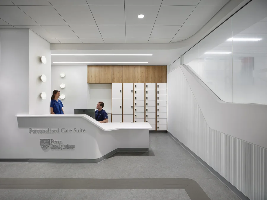
Hoak: Spaces that want to celebrate furniture, structure, and views to the exterior, where the color of the space wants to be quiet.
Wheeler: Cloud Dancer is a foundation color that makes all other materials shine. Its neutrality allows it to coexist with palettes as varied as soft pastels and high-glam metallics, proving that diversity thrives when given space.
Does this color align with your personal design style? Would you use it in your own home or wardrobe?
Lauren Haan, NCIDQ, Associate: For me personally, this color aligns with my own personal style, both in my wardrobe and how I approach my home. I prefer things streamlined and unfussy (but not too stark), so this color supports my overall go-to tones.
Barnett: I do not believe in style. My portfolio as a lead designer, or design director, throughout my career looks as if a different person designed each project. This is a core belief: design must be unique to the client, context, team, typology, constraints, and conceptual idea.
Is this a color you can realistically expect clients to embrace?
Haan: Yes. It’s a safe neutral that works with any palette and supports a wide range of styles. It also allows for easy integration of colors that might align with the client’s brand within their space.